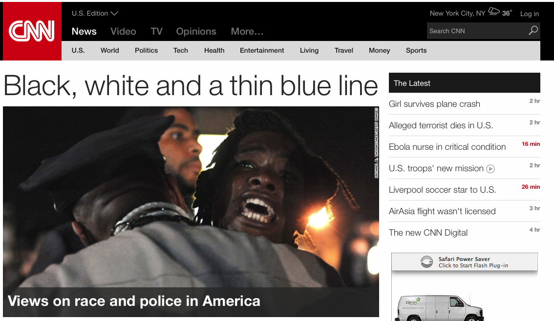
It looks like CNN has unveiled a new website design this weekend.
The new look is highly graphic and dominated by red, white and black with non-bordered images. Very “magaziney” is the word we’re searching for.
New designs always look great (usually) when they are first put up. Then, after awhile, it’s time for a refresh.


